Elena Viniarskaya on Pop Art, Cultural Icons and HOKA at Tuzov Gallery
Author(s): Scott Douglas Jacobsen
Publication (Outlet/Website): Vocal.Media
Publication Date (yyyy/mm/dd): 2026/10/13

By Scott Douglas Jacobsen and Anna Strilets (English-Ukrainian Translator)
Elena Viniarskaya is a Ukrainian director, music-video maker, photographer, and producer of visual stories. In this interview, she discusses paintings she says were presented through Tuzov Gallery, describing acrylic applied in thick layers without premixing colour, portraiture, and affirmations she associates with inner harmony.
Scott Douglas Jacobsen speaks with Elena Viniarskaya about paintings she says were presented through Tuzov Gallery. Viniarskaya describes reclaiming cultural icons for younger viewers, painting intuitively with unmixed colour, using impasto to convey emotion, retreating to paint in solitude, and embedding each canvas with an affirmation directed toward inner harmony.
Scott Douglas Jacobsen: Today, I am speaking with Elena Viniarskaya about her work presented through Tuzov Gallery. What inspired this piece?
Elena Viniarskaya: Colour is the starting point for this work. I want younger audiences to rediscover cultural icons such as Brigitte Bardot, whose significance may no longer be familiar to them. By rendering these figures in colour, I bring their images into the present.
I am especially drawn to actresses of mid-century cinema, including those who appeared in black-and-white films. I want their images to feel contemporary rather than confined to the past.
Jacobsen: Do you see your work as restoring these figures to public memory for a new generation?
Viniarskaya: Yes. That is central to what I do. Today, a person can become famous online almost instantly, sometimes through a single video. Many of the figures I paint built their reputations through sustained creative work. I want younger viewers to understand their cultural importance.
Jacobsen: Which decade do you focus on most when choosing figures to revisit?
Viniarskaya: I do not focus on a single decade. I once found a book of cultural icons that included figures from the 1920s, 1930s, 1940s, and later periods. I choose subjects through their faces, especially their eyes, and through a personal visual connection with them.
For this work, I wanted to create a contemporary counterpart to the Mona Lisa. The face is so familiar within everyday visual culture that it seems to look back at us wherever we go. In that sense, it is a Mona Lisa for our time.
Jacobsen: Among the figures you have brought back into view, who stands out most to you? Then we can return to the work displayed here.
Viniarskaya: He is not a conventional pop-culture icon. The work portrays a Ukrainian serviceman who was seriously wounded in the war. I have many photographs of him. For me, he is more important than any celebrity. He is the defining figure in this collection.
Jacobsen: What is this piece called, and what does it signify?
Viniarskaya: It is titled Happy Face. It is a portrait of Joaquin Phoenix, rather than simply an image of the Joker. I am interested in Phoenix as a person and in the warmth of his expression. His eyes and face convey the emotion I wanted to express.
Jacobsen: The palette includes substantial blue, green, red, white, and black, with only a small amount of yellow around the eye. Why did you choose those colours?
Viniarskaya: The palette develops intuitively while I work. I keep many colours available and respond to what the portrait seems to require. The subject guides the treatment, including the balance of blue, green, red, white, black, and yellow.
Jacobsen: What medium did you use for this work?
Viniarskaya: I work in acrylic, but I use it in a way that resembles oil painting. I do not premix colours. I apply pure colours directly.
The work is not intended only to be seen. It is also intended to be felt. Even with your eyes closed, you can sense its texture and emotion.
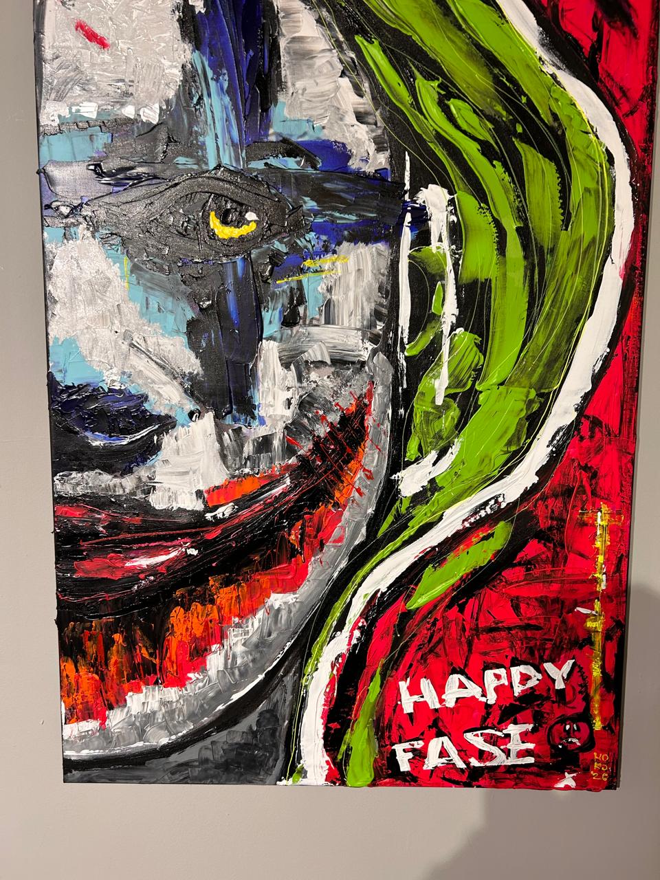
Jacobsen: Why do you apply the acrylic so thickly?
Viniarskaya: It is intuitive. I follow my instinct rather than a fixed method. Because I do not mix colours, I apply them directly in the form and intensity that feel right. The impasto carries the emotion.
Jacobsen: How do you combine outside influences with your own emotional response?
Viniarskaya: Painting is a private and intensive process for me. I absorb experiences, emotions, and impressions over time. When I feel ready, I rent a house by the sea for a month and paint without distraction. I continue until I have expressed what I have carried within me. Then I return to everyday life and wait until I feel the need to create again.
Jacobsen: Vlad Tuzov, what drew the gallery to Viniarskaya’s work?
Tuzov: I call it “Dubai style.” She has considerable potential and is one of Ukraine’s most distinctive colourists working within a pop-art sensibility. Her future is bright. That is why I am committed to promoting her work and investing in her development.
Jacobsen: You have spoken about emotional expression and painting retreats. Beyond that, does a spiritual practice or belief influence your work?
Viniarskaya: Yes. Every painting has its own affirmation. I incorporate the affirmation into the work and write it on the back of the canvas.
It is not a phrase that I prepare in advance. It comes to me through the person I am portraying and through the painting itself, and I direct it toward God. The affirmation also informs the colours. If the feeling is peace or calm, for example, the work may be dominated by green.
Jacobsen: What does HOKA mean?
Viniarskaya: HOKA is an affirmation, a brief inscription associated with this work. For me, it means complete inner harmony.
Jacobsen: Do you have any final thoughts?
Viniarskaya: I want everyone to find HOKA, complete inner harmony.
Jacobsen: Thank you very much for your time. I appreciate it.
Viniarskaya: Thank you.
Last updated May 3, 2025. These terms govern all In Sight Publishing content—past, present, and future—and supersede any prior notices. In Sight Publishing by Scott Douglas Jacobsen is licensed under a Creative Commons BY‑NC‑ND 4.0; © In Sight Publishing by Scott Douglas Jacobsen 2012–Present. All trademarks, performances, databases & branding are owned by their rights holders; no use without permission. Unauthorized copying, modification, framing or public communication is prohibited. External links are not endorsed. Cookies & tracking require consent, and data processing complies with PIPEDA & GDPR; no data from children < 13 (COPPA). Content meets WCAG 2.1 AA under the Accessible Canada Act & is preserved in open archival formats with backups. Excerpts & links require full credit & hyperlink; limited quoting under fair-dealing & fair-use. All content is informational; no liability for errors or omissions: Feedback welcome, and verified errors corrected promptly. For permissions or DMCA notices, email: scott.jacobsen2025@gmail.com. Site use is governed by BC laws; content is “as‑is,” liability limited, users indemnify us; moral, performers’ & database sui generis rights reserved.


